모바일 기기는 화면 크기가 천차만별이다. 그렇기 때문에 어떤 요소의 크기를 수치로 정해두면 기기별로 크기가 달라보일 수 있다. 이러한 문제점을 해결하기 위해 react-native에서는 Dimensions라는 API를 기본적으로 제공해준다.
|
1
2
3
4
5
|
import { Dimensions } from 'react-native';
// 화면 너비, 높이 구하는 방법
const windowWidth = Dimensions.get('window').width;
const windowHeight = Dimensions.get('window').height;
|
cs |
Dimensions를 통해 현재 기기의 화면 크기를 알 수 있다.
Input 양 쪽에 20px의 마진을 두고싶다면 아래와 같이 설정하면 된다.
${({ width }) => width - 40}px
|
1
2
3
4
5
6
7
8
9
10
11
12
13
14
15
16
17
18
19
|
import { Dimensions } from "react-native";
import styled from "styled-components/native";
const StyledInput = styled.TextInput`
// Component를 생성할 때 전달받은 width로 input의 크기를 설정한다.
width: ${({ width }) => width - 40}px;
// 생략
`;
const Input = () => {
const width = Dimensions.get("window").width;
return (
<StyledInput
width={width}
// ... 생략됨
/>
);
}
|
cs |
그런데 이 값은 처음 화면의 크기에 고정된다. 기기가 회전해도 이 값이 바뀌지 않는다.
이것을 해결하기 위해 useWindowDimensions를 사용한다.
useWindowDimensions는 화면크기의 변화를 감지하는 Hook이다. 화면크기의 변화를 감지하면 자동으로 업데이트를 해준다.
|
1
2
3
4
5
|
import { useWindowDimensions } from "react-native";
const width = useWindowDimensions().width;
const height = useWindowDimensions().height;
// 혹은 const { height, width } = useWindowDimensions();
|
cs |
변화된 화면에도 적용할 수 있도록 한다.
Dimensions 적용 전 (width: 100%;인 상태)
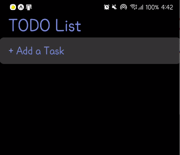
Dimensions 적용 후 (width: ${({ width }) => width - 40}px)

* 중앙에 위치하지 않는다면 상위 View의 스타일에서 align-items: center;를 설정했는지 확인해봐야 한다.)
참고한 사이트
https://reactnative.dev/docs/dimensions
Dimensions · React Native
useWindowDimensions is the preferred API for React components. Unlike Dimensions, it updates as the window's dimensions update. This works nicely with the React paradigm.
reactnative.dev
'Javascript' 카테고리의 다른 글
| [Javascript] Javascript에서 ?(물음표) 사용법 (1) | 2022.01.12 |
|---|---|
| [Javascript] 목록의 자료를 삭제하는 방법(Array, Object) (0) | 2021.12.16 |
| Canvas 에서 마우스로 부드러운 선 그리기 (0) | 2021.11.30 |
| Canvas 모바일에서 사용하기(touchevent) (0) | 2021.11.12 |
| Canvas 지우기, 초기화하기, 그림으로 저장 (0) | 2021.11.10 |